Be the first to read my latest entries on the New WOBM Blog!!!
Wednesday, March 07, 2007
New Wardrobe
As spring is here, I felt the need of a new skin for Words of a Broken Mirror. So I took a template from here (free), and with a lot of help and patience from Ryan, I managed to also modify it to finally please me.
I like the new look , the red colour is an eye taker. I wnated to comment on your new hair colour and how it suits you but I felt there is no place for me to comment. By the way don't ever change your profile image it is the best of you.
I liked the old layout more, as it filled my screen with no white space around the content. The new look has fixed dimensions. It looks alright, but suffers from the fact that computer screens are wide (horizontal), not tall (vertical), so there is some wasted space and increased scrolling and wrapping. Then again, I'm not an art critic, so my opinions may not be as valid as I think they are :)
Alina, excuse my ignorance, but on what grounds are wide-screen sites obsolete? Especially if they're nicely done so the content just adapts to the viewer's resolution, and it's not the viewer who adapts his resolution to match the site. Is there any standard/study/recommendation about this "out of date"-ness that you proclaim? :)
What I know comes from the web dev dept. And from an article I read a while ago about site design and which sites were good and which not. I am sorry, but I don't have the link anymore.
Alright, I'll throw a question to my web department to see what they think about the subject. It's just interesting to consider a format to be bad just because "people say so". Otherwise, I'll have to get on reading some web design/publishing books :)
You can say a site/blog does not respect the dos and don'ts by comparing it against industry standards (in this case web design). Based on personal experience, you can say you just don't like it. I did not like mine because on wide screens with large resolution I had to put to much effort to read and it all looked a bit like watching tennis. :)
Name: Alina Home: Bucharest, Bucharest, Romania About Me: "This is my church. This is where I heal my hurts". It's also where I feel free and my preferred means of expression. See my complete profile
ADS
On this blog, I accept sponsored reviews. Expect one such entry every now and then.I am picky about them, but you can contact me for the details.


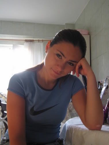

I like the new look , the red colour is an eye taker.
I wnated to comment on your new hair colour and how it suits you but I felt there is no place for me to comment.
By the way don't ever change your profile image it is the best of you.